An Italian coffee house, translated.
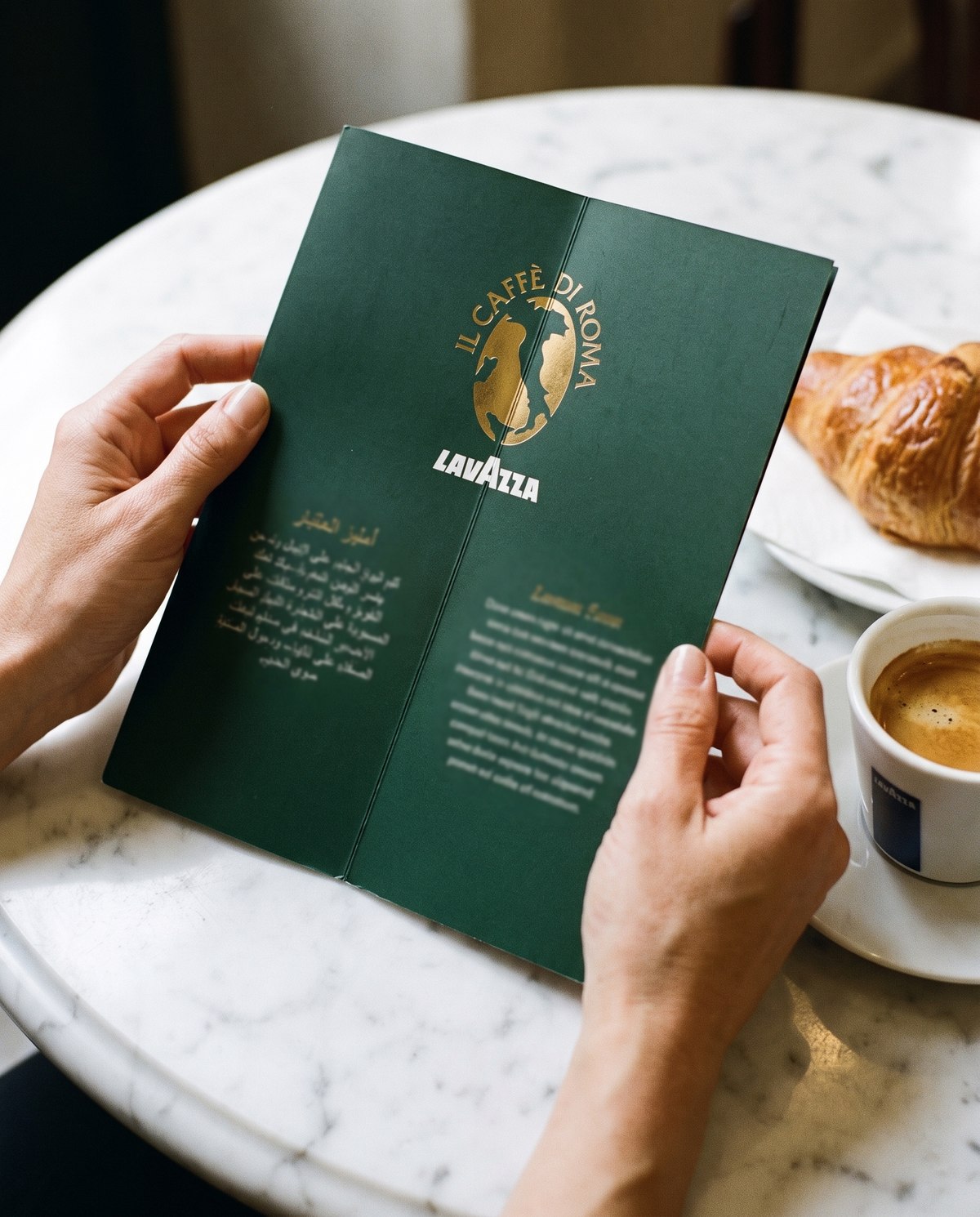
A menu written in Rome, read in Doha.
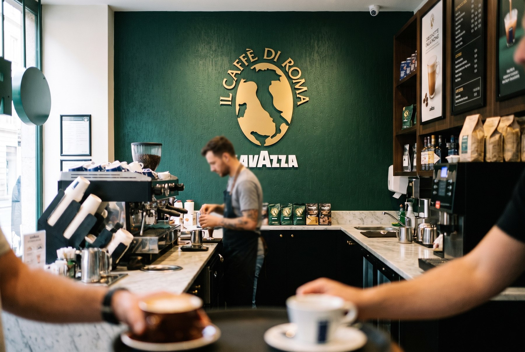
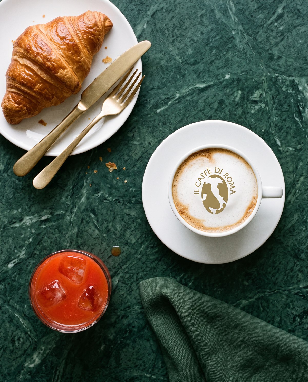
Il Caffè di Roma travels on being unmistakably Italian. Its menu is a list of Italian words, its green is a specific green, and its cities run down the back of the menu card: Rome, Turin, Perugia, Paris, Barcelona, Lisboa.
When that list reached Dubai, Abu Dhabi, Doha, Damascus, Aleppo and Tripoli, the brand had to work in two scripts and five markets at once, in stores that opened on different dates with different fit-outs, without the Italian ever thinning out.
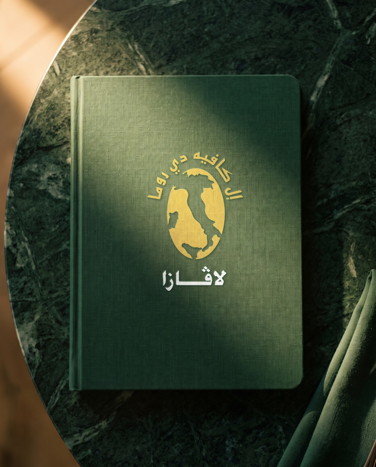
Keep the Italian. Add the Arabic.
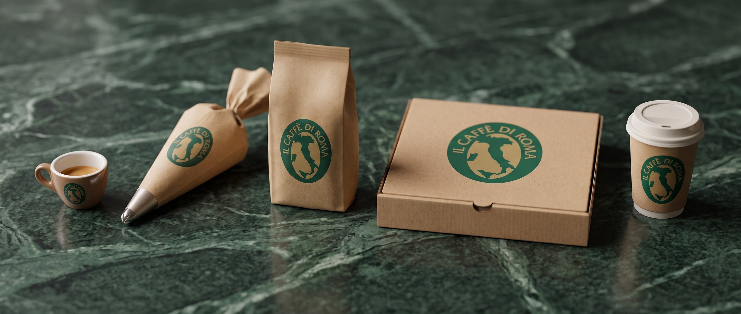
Nothing was re-designed. The job was adaptation: sitting Arabic alongside the Italian so it reads as one designed thing rather than a translation stuck on afterwards, then producing it across the network, from illuminated shopfront signage down to the pizza box.
Then keeping it consistent. Menu boards, seasonal promotions, hotel posters, delivery packaging and in-store campaigns, all built off the same green, the same type, the same photography discipline, and installed store by store across the Gulf and North Africa.