A holding group, gathered under one signature.
One family name. Many businesses. Two languages.
Faraj Bin Hamoodah is a name that carries decades of Abu Dhabi business across a family of companies. Each had its own momentum; together they lacked one face.
The brief: a single identity strong enough to hold the group together, working as naturally in Arabic as in Latin script, and formal enough to sit on anything from a ministry letter to a showroom wall.
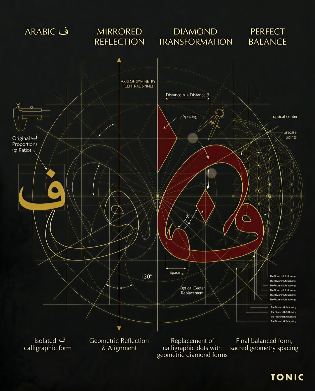
A bilingual signature, built on the diamond.
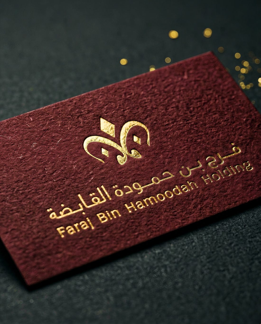
The mark begins with the Arabic letter of the family name, drawn as calligraphy, mirrored into a diamond: reflection, transformation, perfect balance. It reads as heritage from across the majlis and as geometry up close.
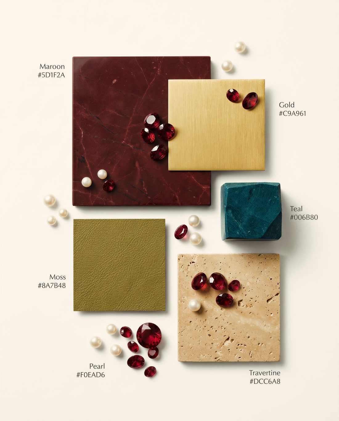
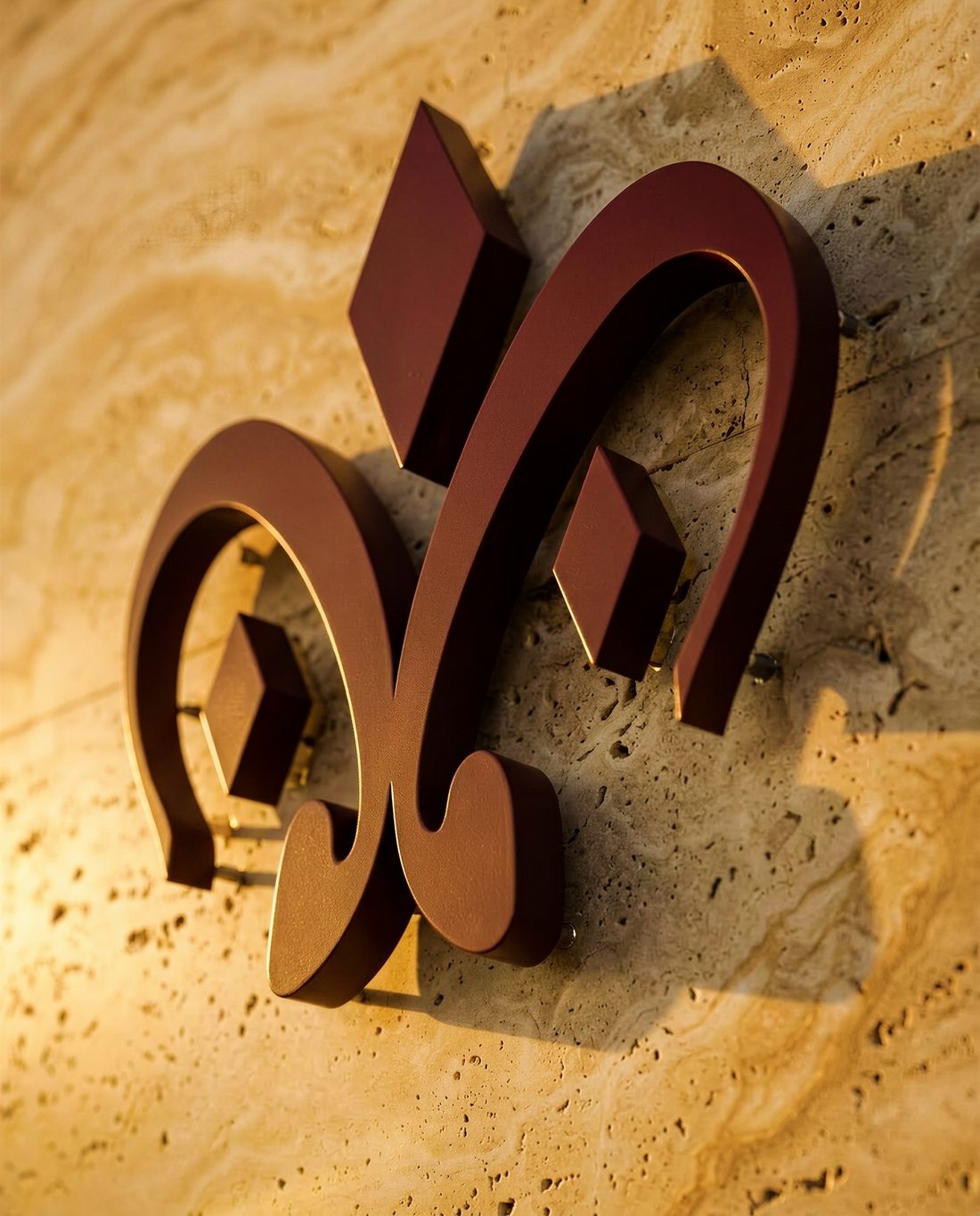
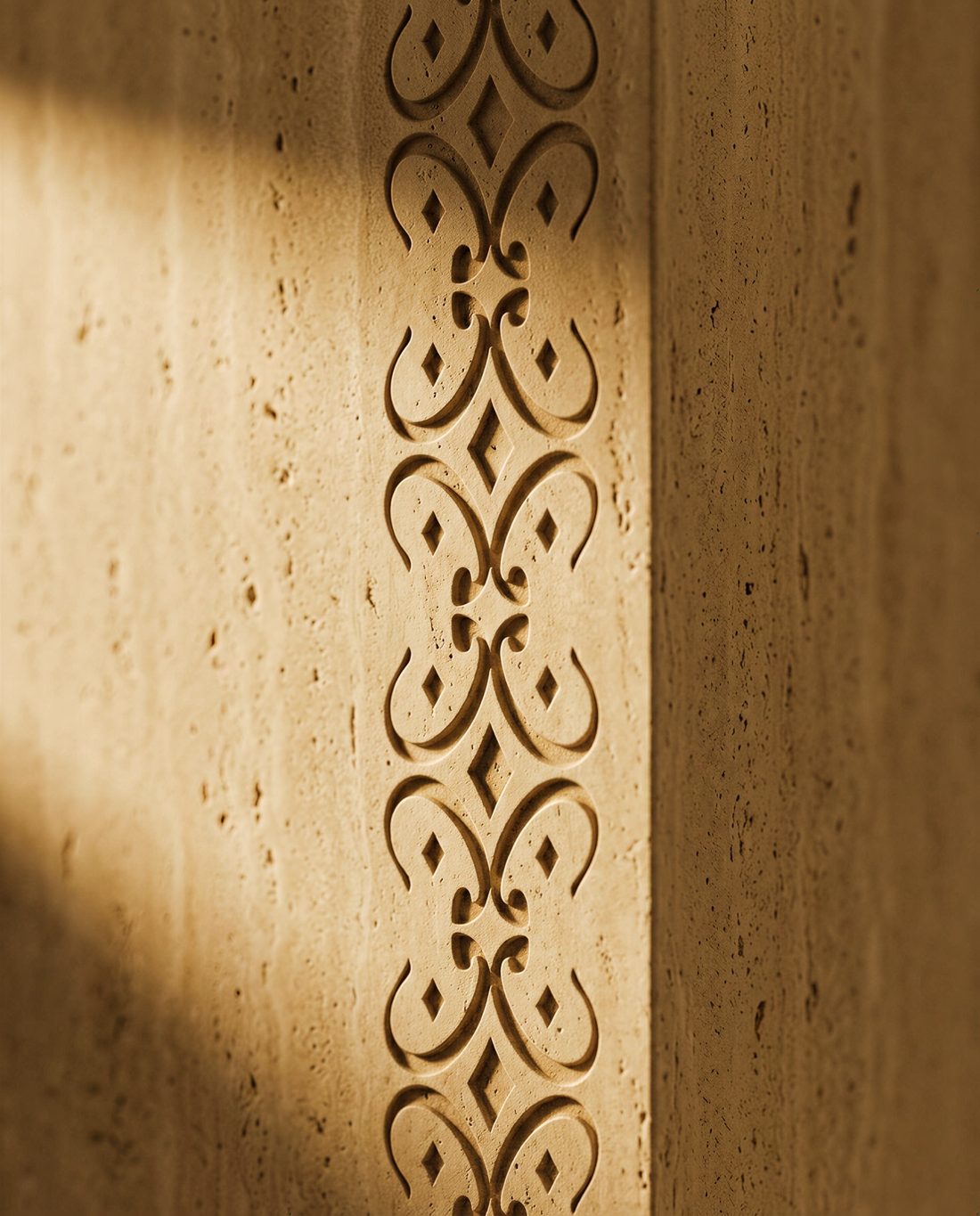
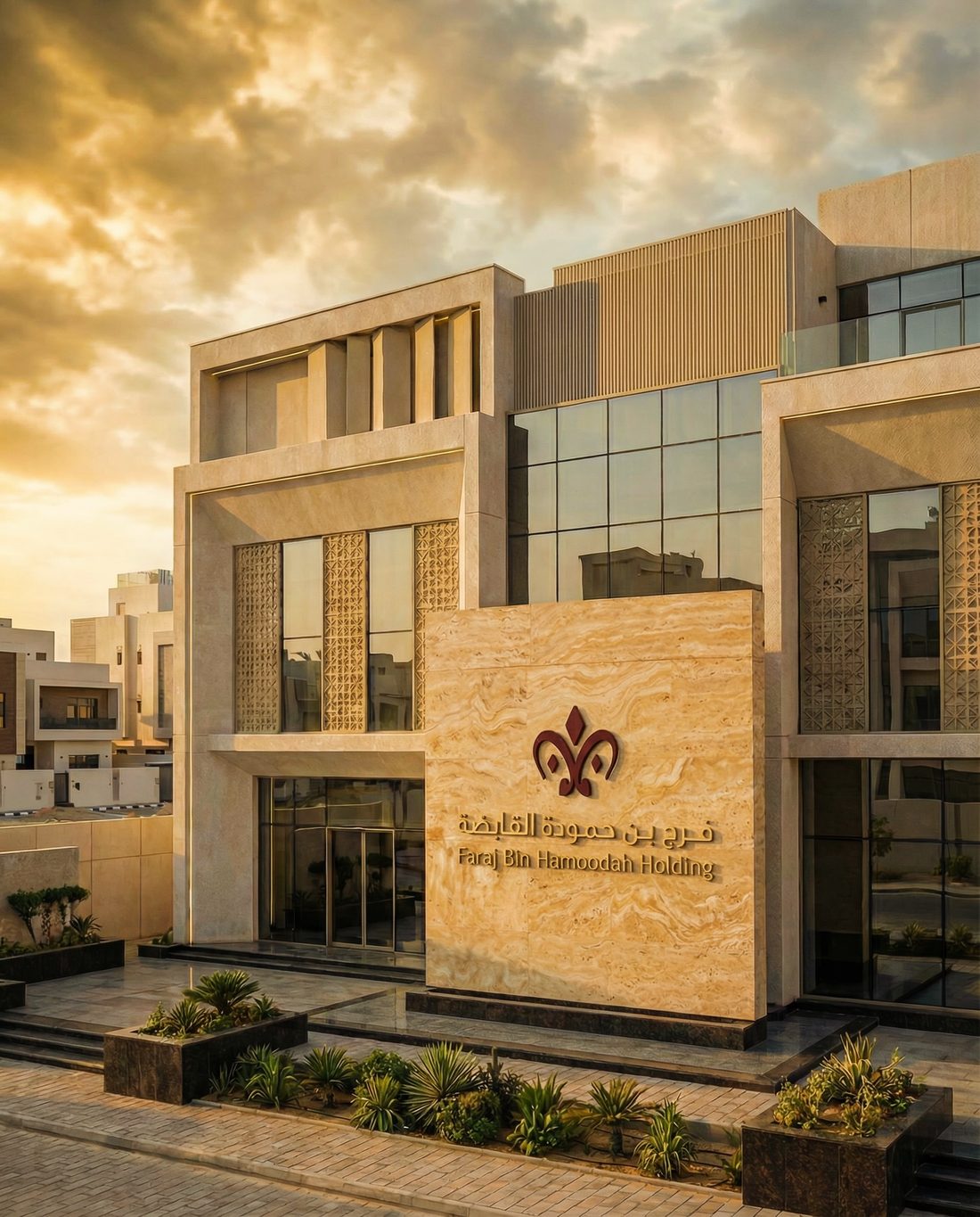
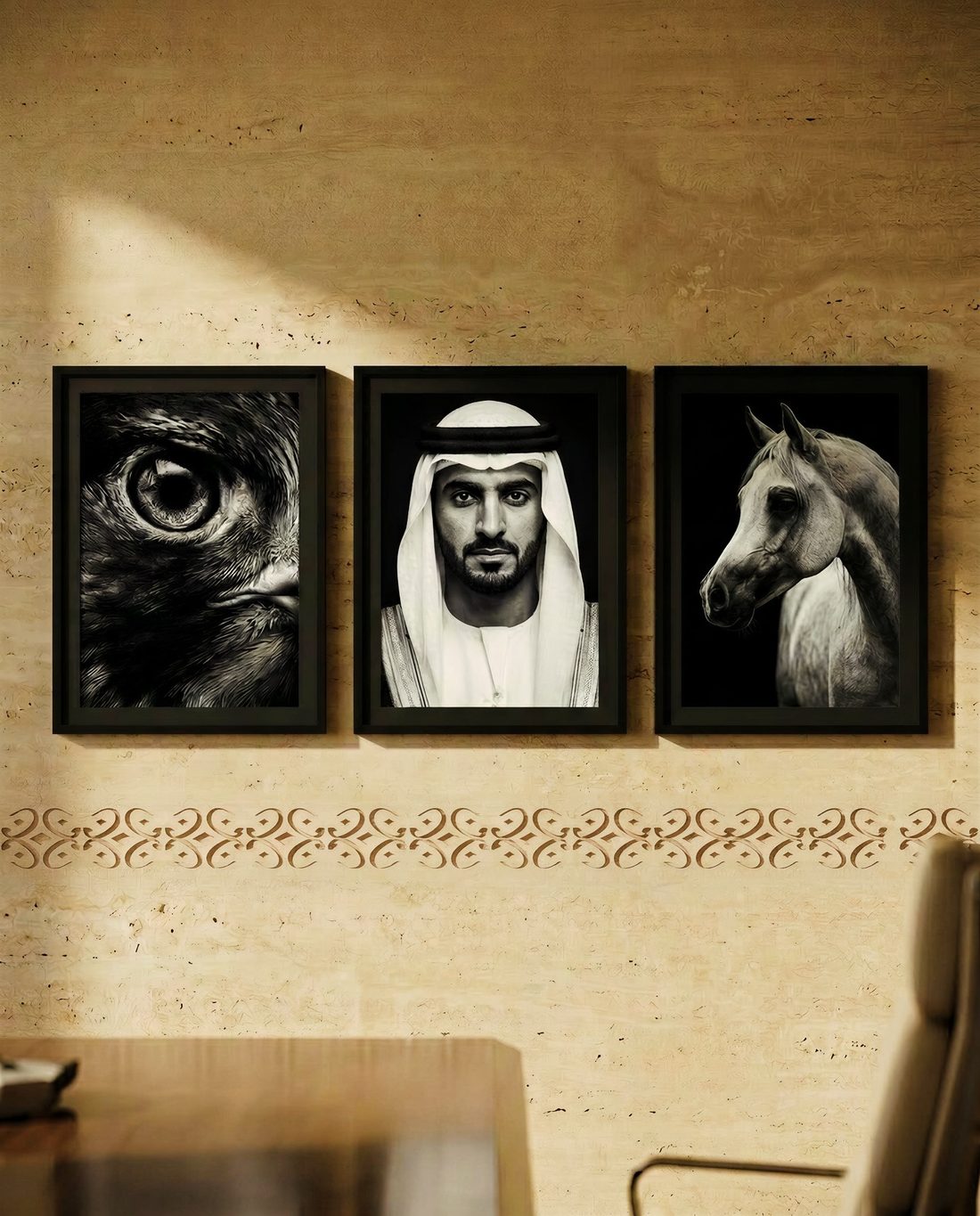
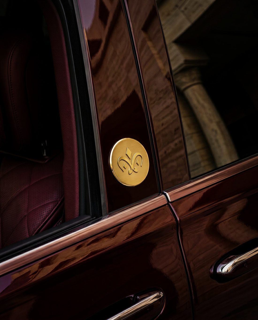
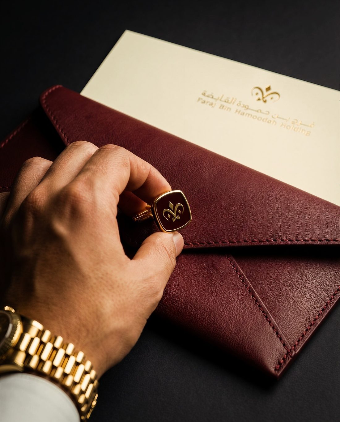
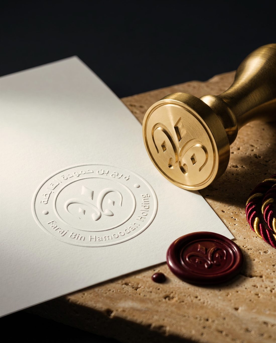
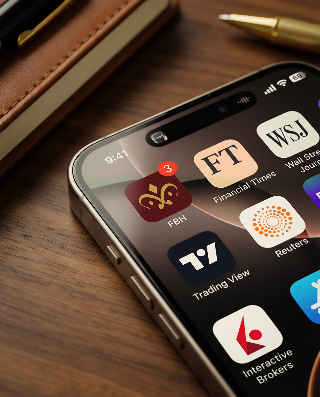
A material world, not just a mark. Maroon leather, brushed gold, moss, pearl, and travertine carry the identity from the headquarters facade to stationery, wax seals, a car door, and the group's own apps.